Non-profit organization Neumünster.
Making community visible – defining identity.
How do you translate over a hundred years of history into a contemporary, understandable, and sustainable brand identity—without losing sight of its roots? For the Gemeinnützige Gesellschaft Neumünster (GGN) and the Aventin retirement home, Studio Blyss developed a new visual framework that respects tradition while providing orientation for the future.
Client
Non-profit organization Neumünster, Zurich
– GGN Foundation
– Aventin retirement home
Creative Services
Rebranding
Corporate design & visual identity
Image concept
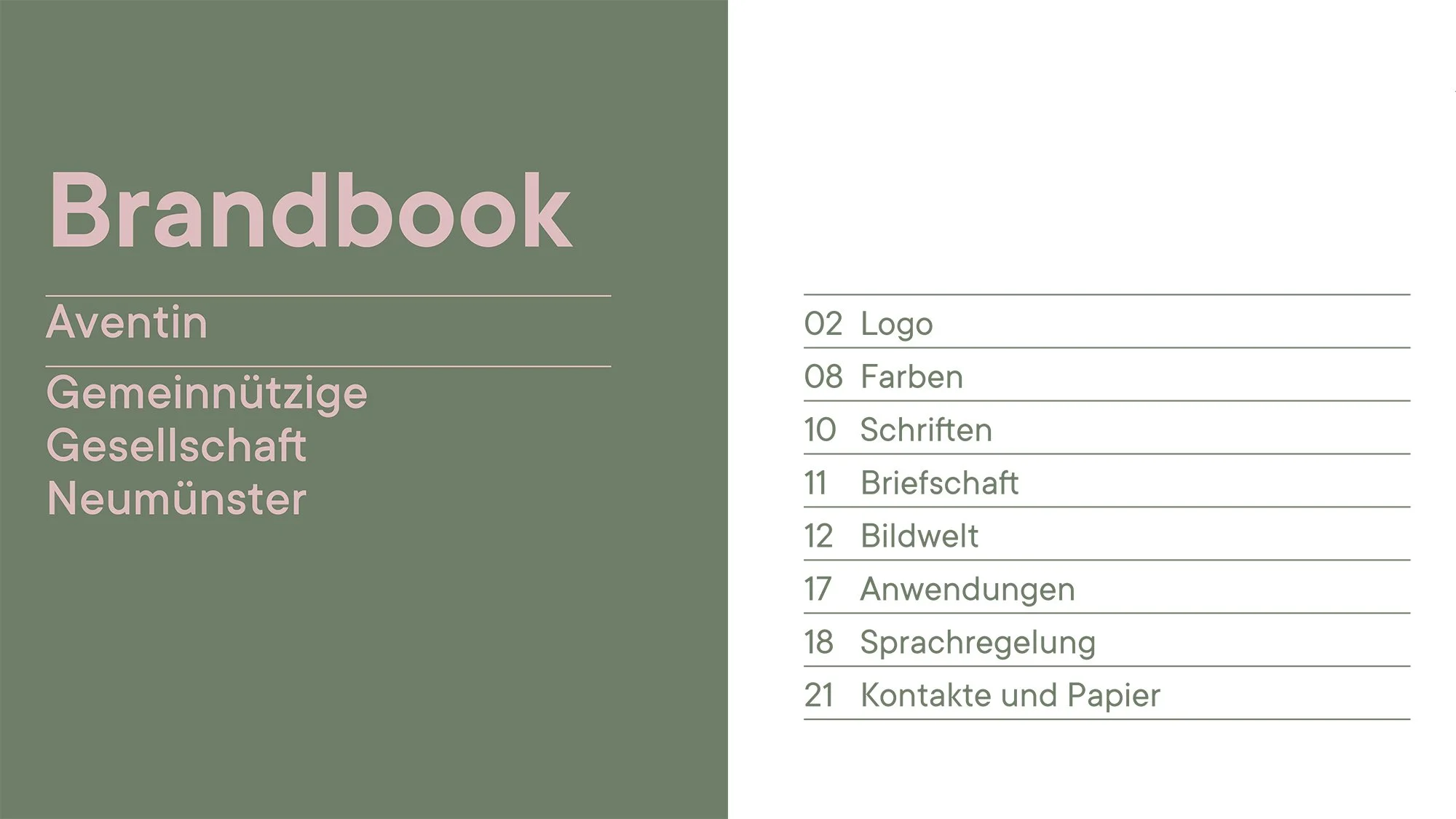
Brand book & guidelines
Website concept
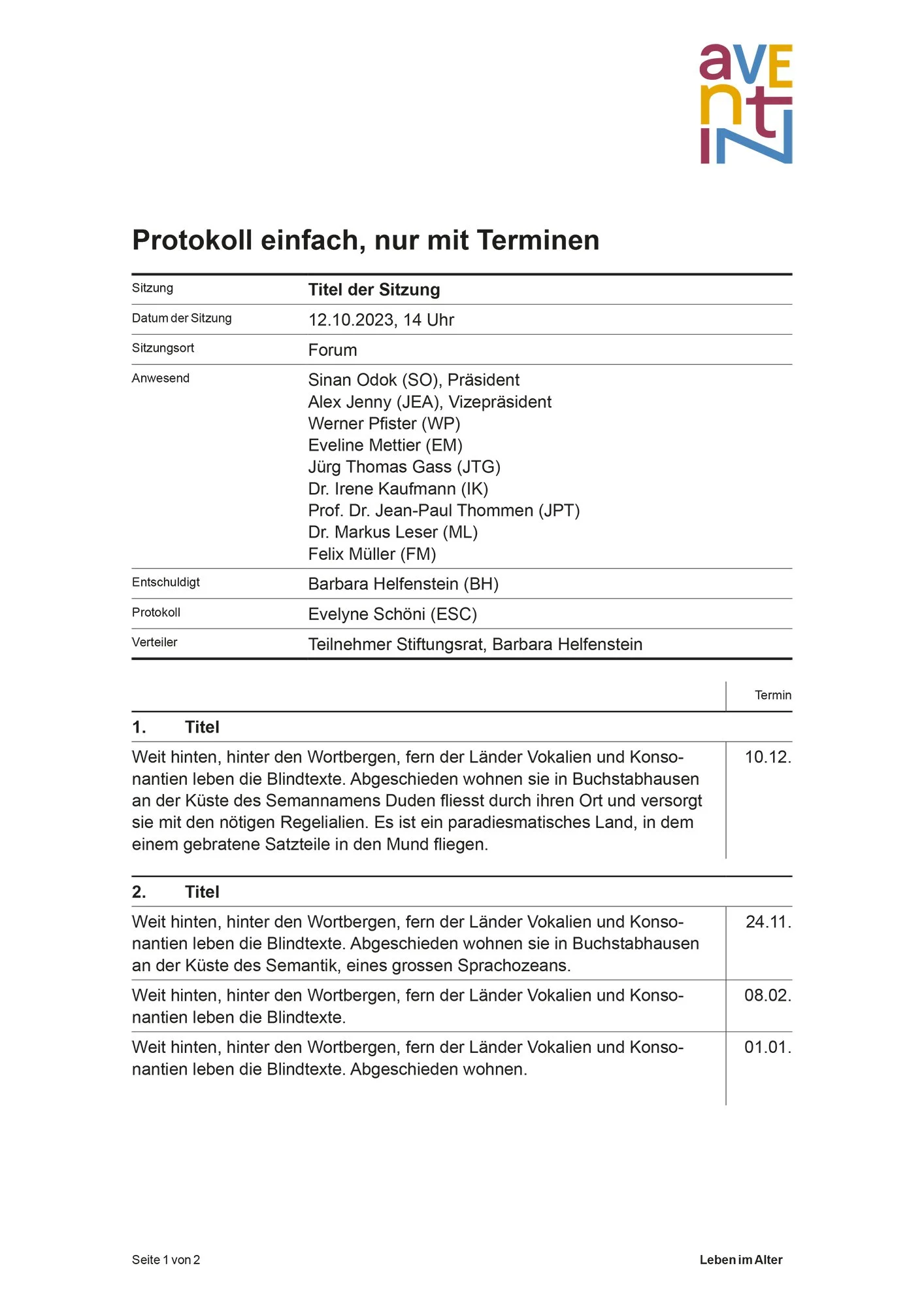
Template for office and internal communication
Signage
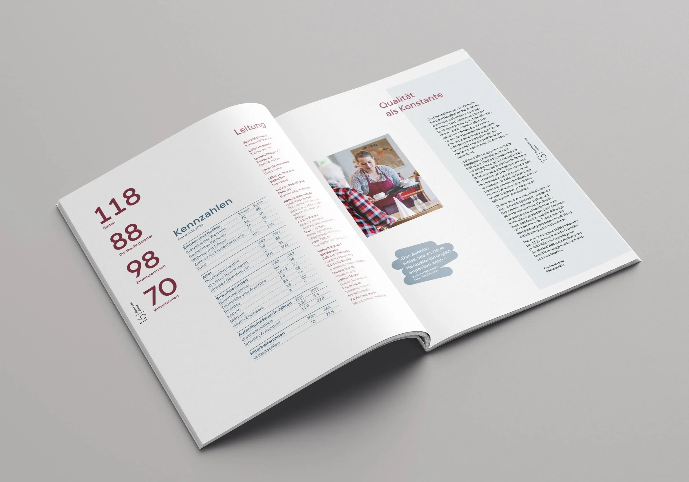
Annual report
-
The Neumünster Charitable Society is one of Zurich's oldest private charitable institutions. Having grown over time, it combines a foundation, an association, a fund, and the Aventin retirement home under one roof. However, this depth of content was hardly visible to the outside world: the brand structure was complex, the image was inconsistent, and the digital presence was no longer up to date.
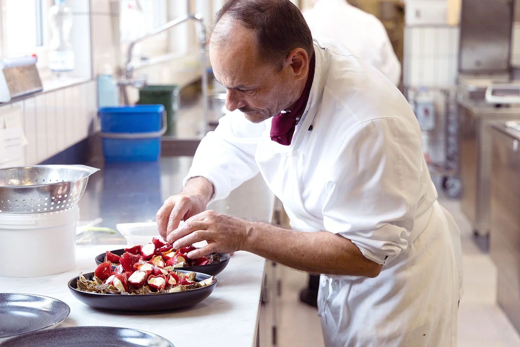
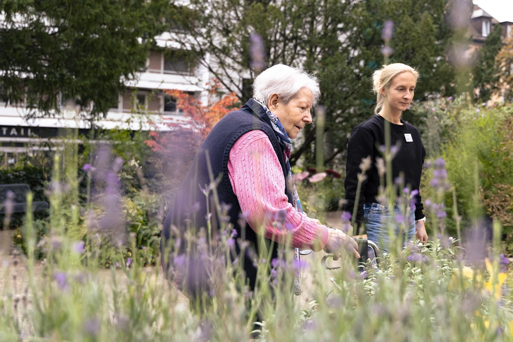
At the same time, both the GGN Foundation and the Aventin retirement home were undergoing strategic development processes. New mission statements, attitudes, and visions for the future were formulated—but found little resonance in the existing image. The need for action was particularly noticeable for Aventin: in the competition for skilled workers, trust, and visibility, its image was increasingly falling behind.
One key condition was that the existing logos could not be replaced, only further developed. -
Studio Blyss was brought in to rethink the visual identity of GGN and Aventin and translate it into a consistent, future-proof system. The aim was to clearly illustrate the relationship between the foundation and the retirement home without sacrificing their independence – and to create a solid foundation for long-term, strategic communication.
The fundamental strategic guidelines for the rebranding were developed in close collaboration with Martin Kessler Kommunikation. Studio Blyss was responsible for the visual translation of this strategy and its implementation across all applications. -
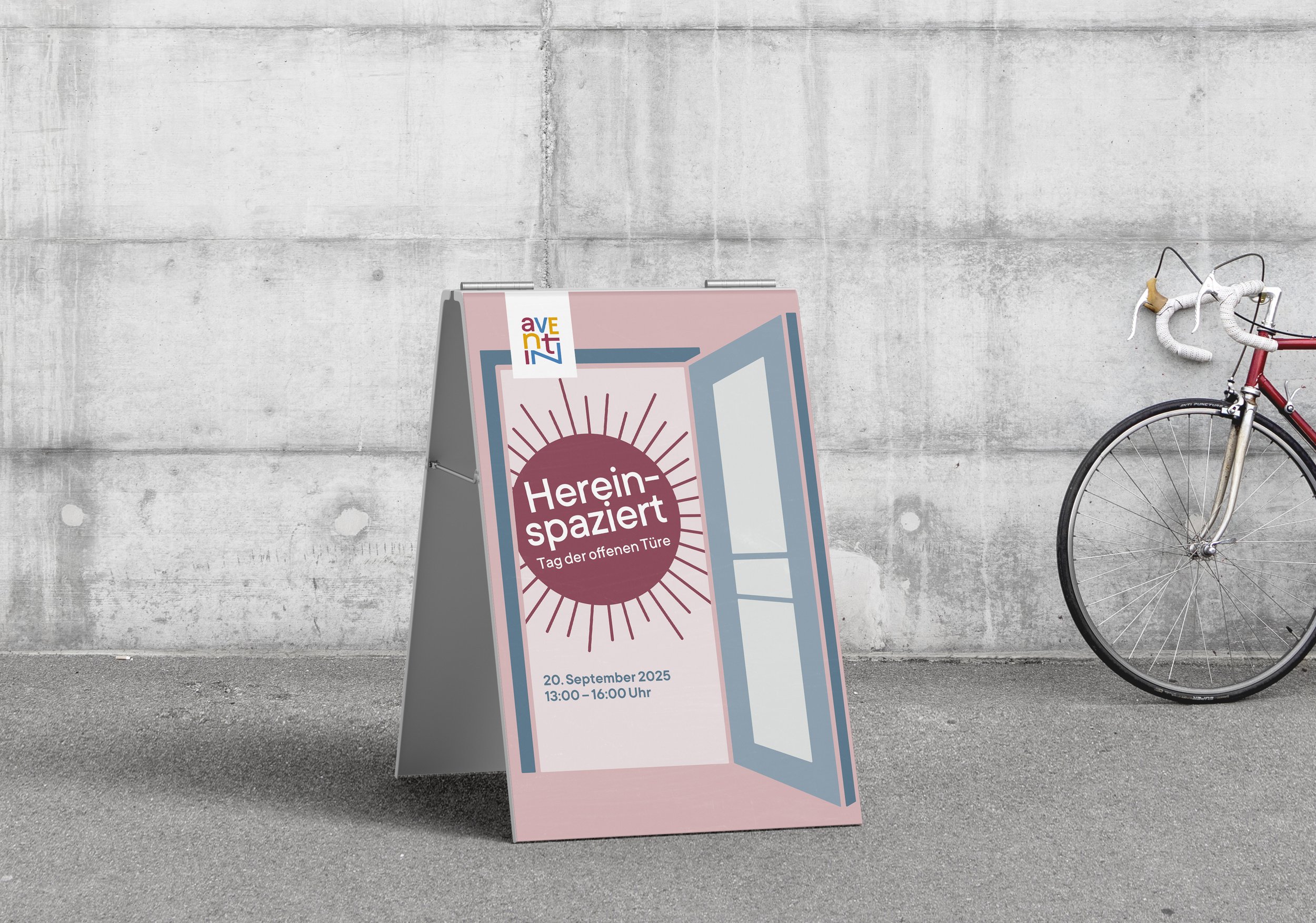
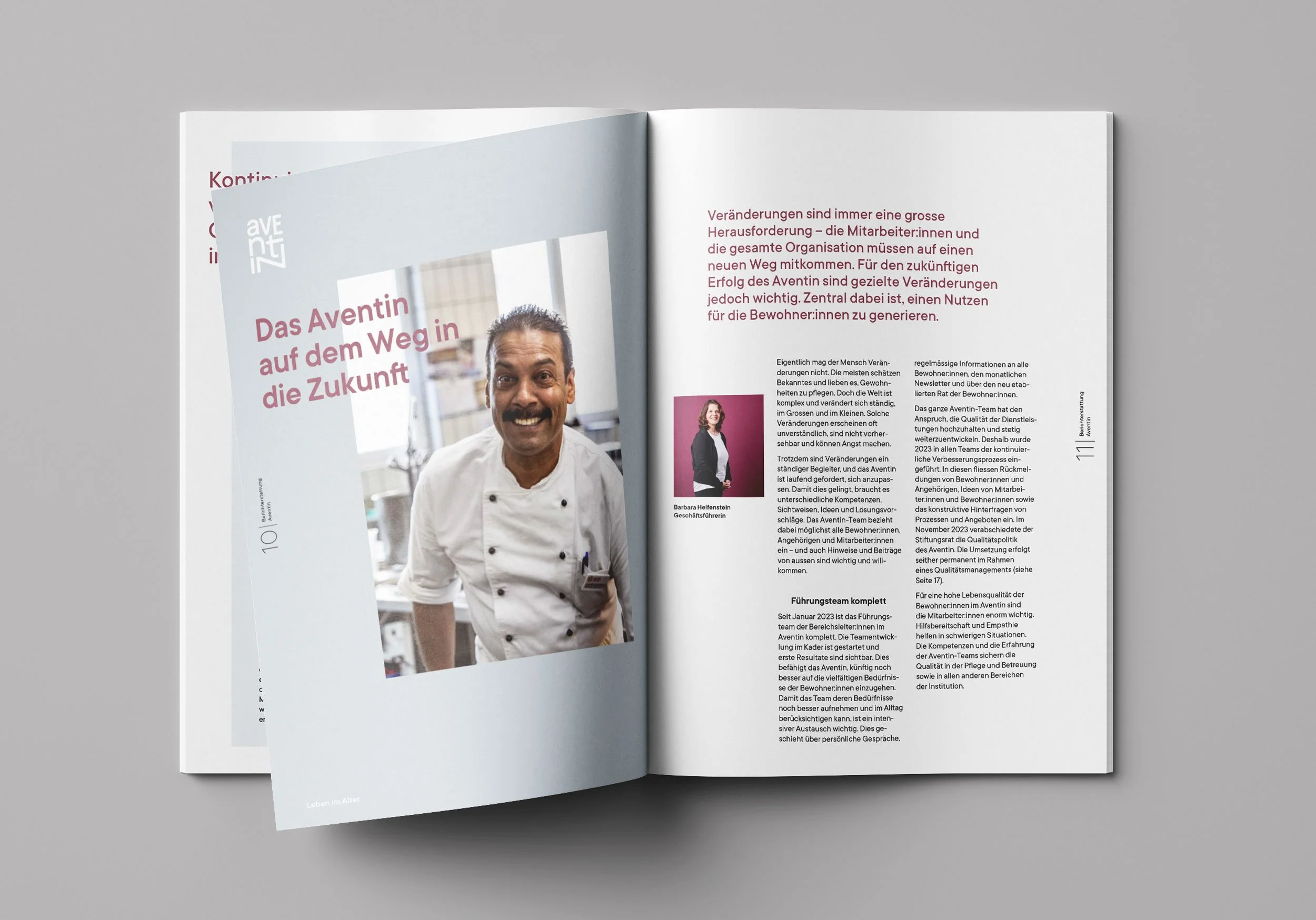
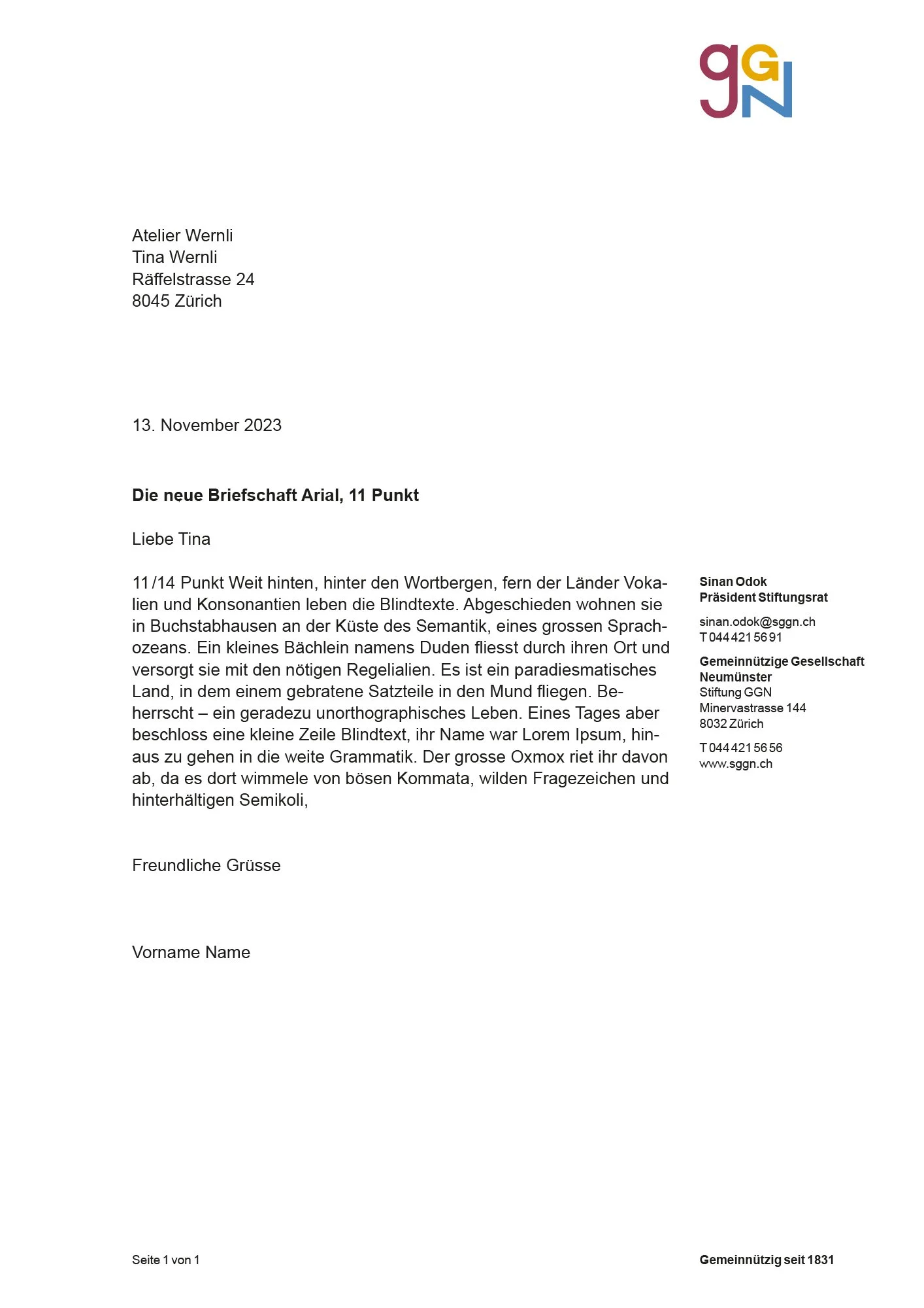
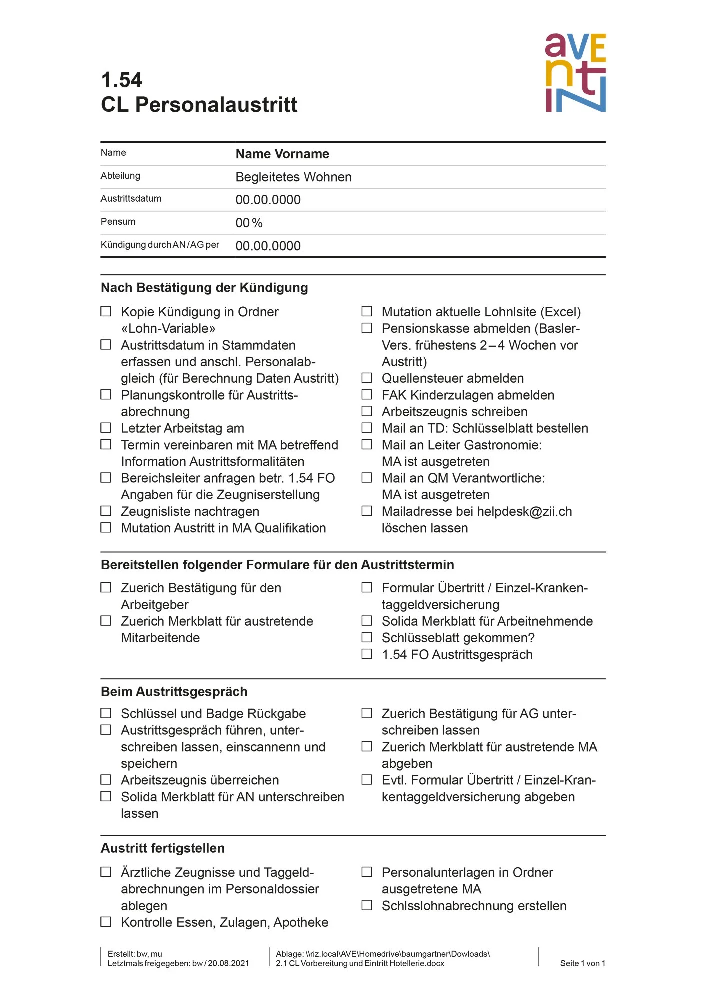
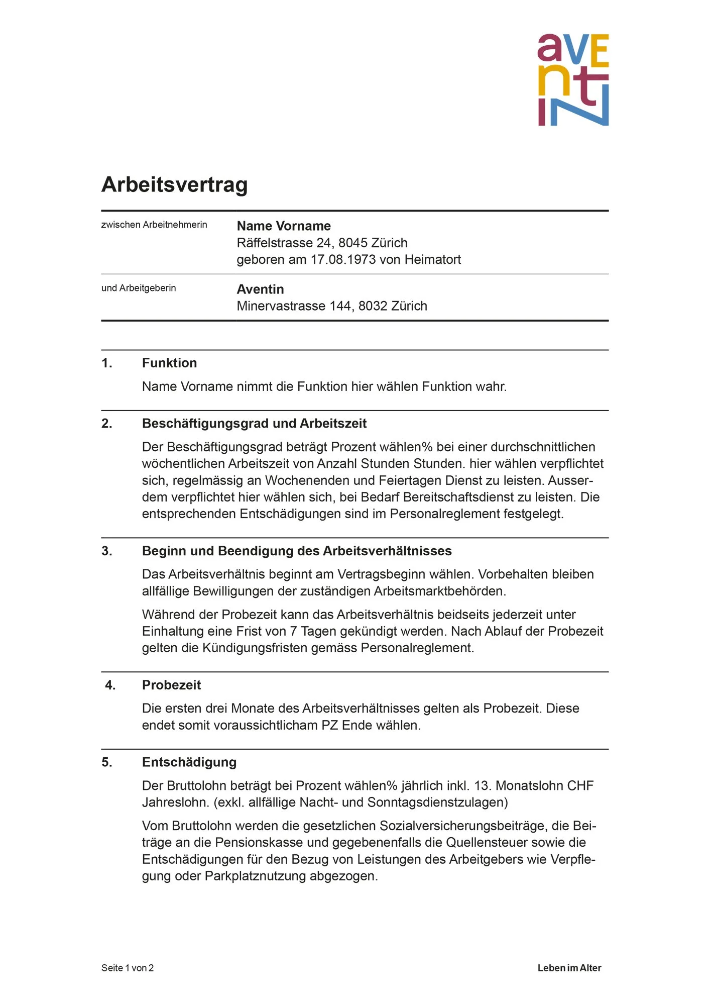
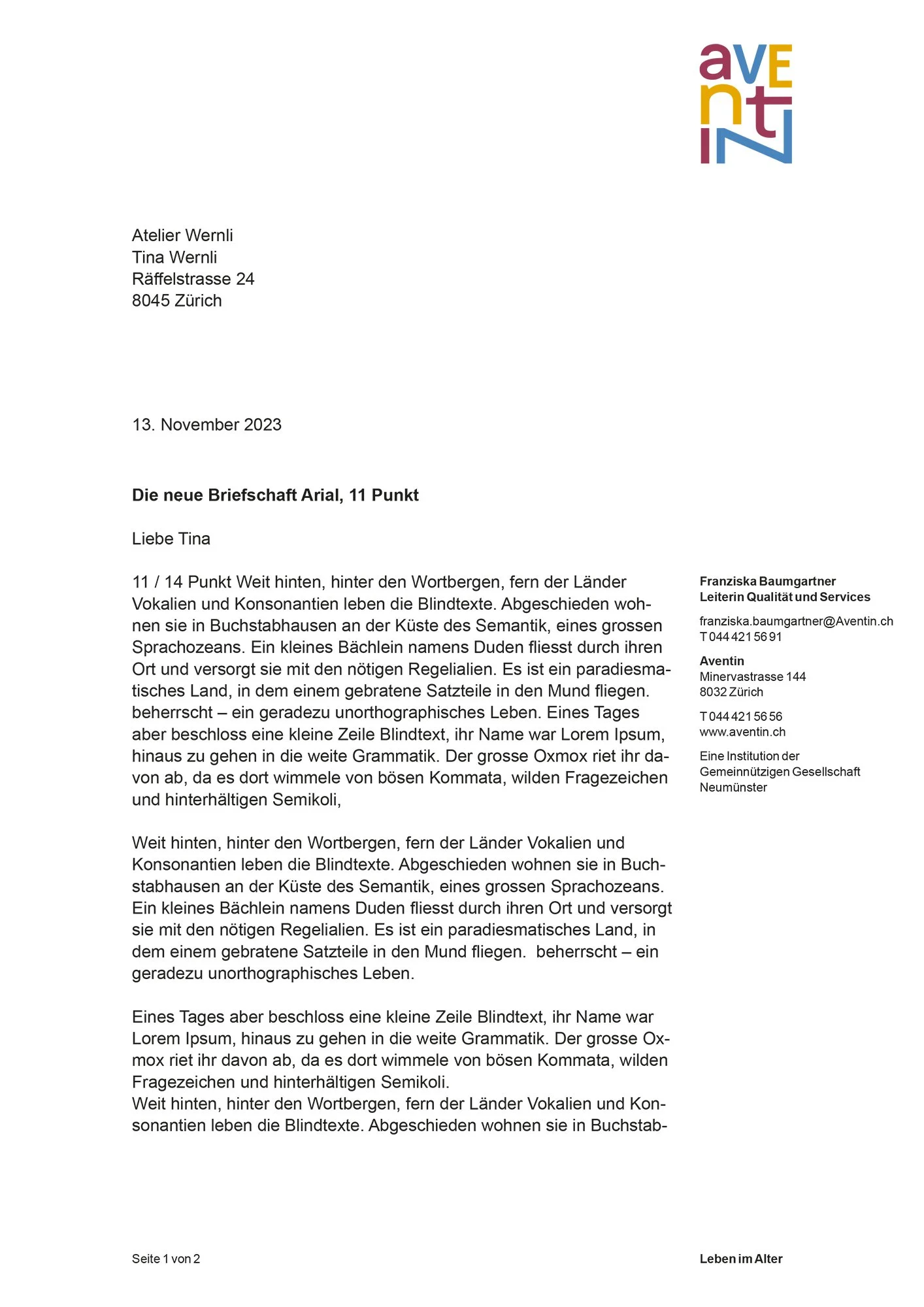
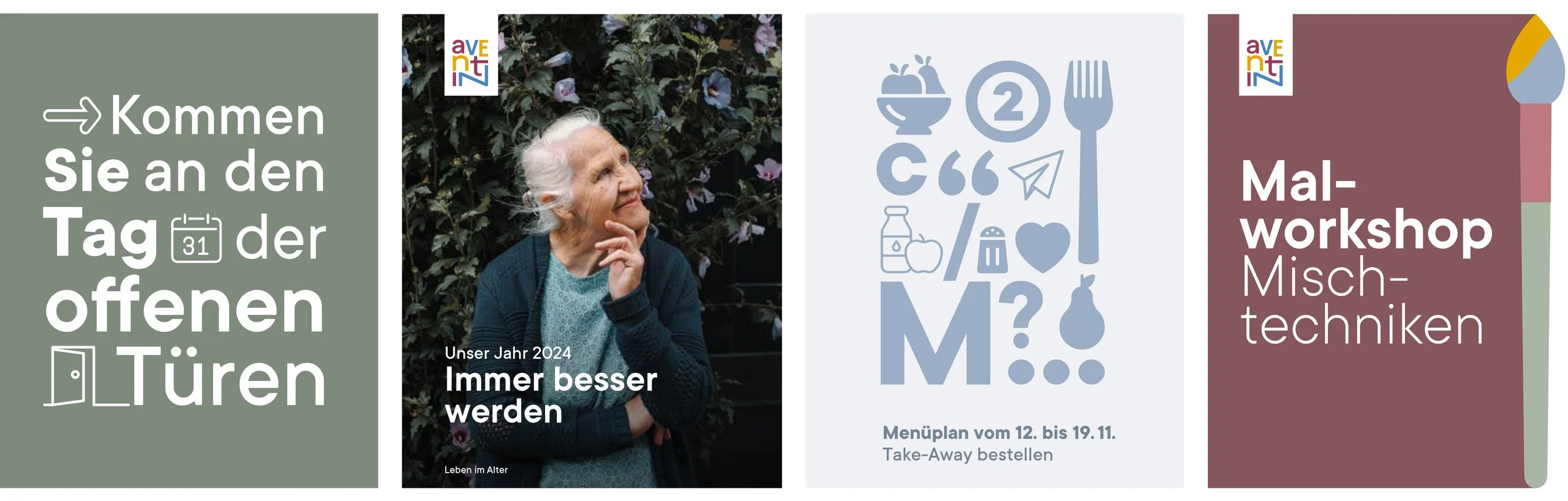
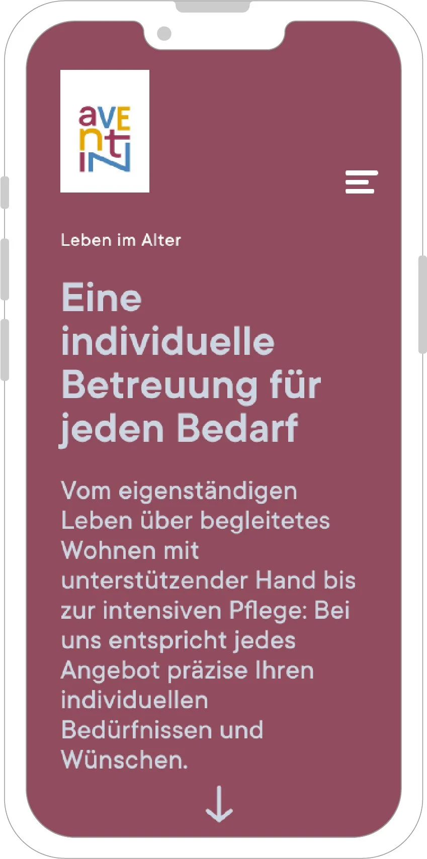
The central idea behind the design is community: the connection between the GGN Foundation and the Aventin retirement home remains visible, while both brands retain their own identity. The existing logos were carefully refined and embedded in a common visual system.
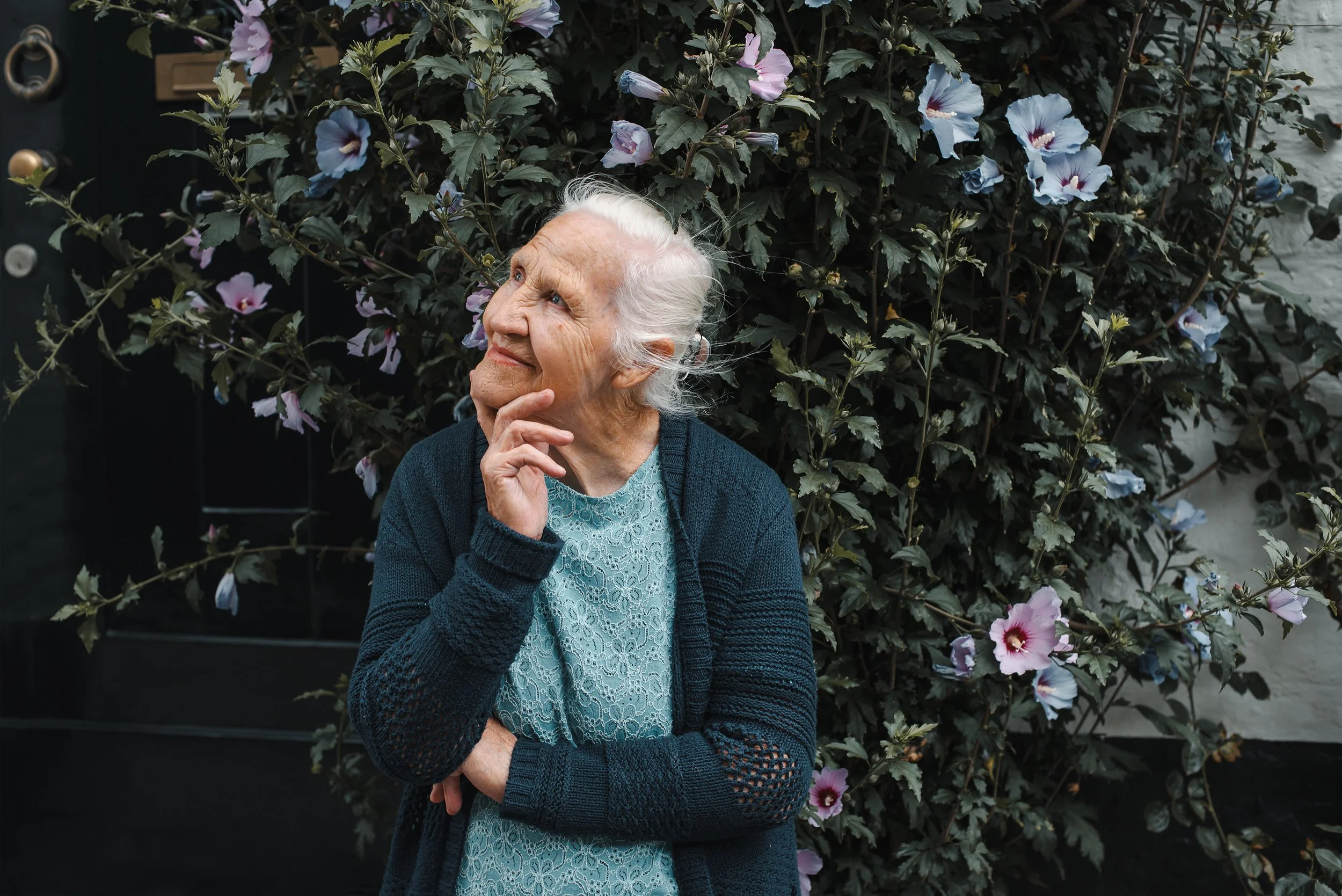
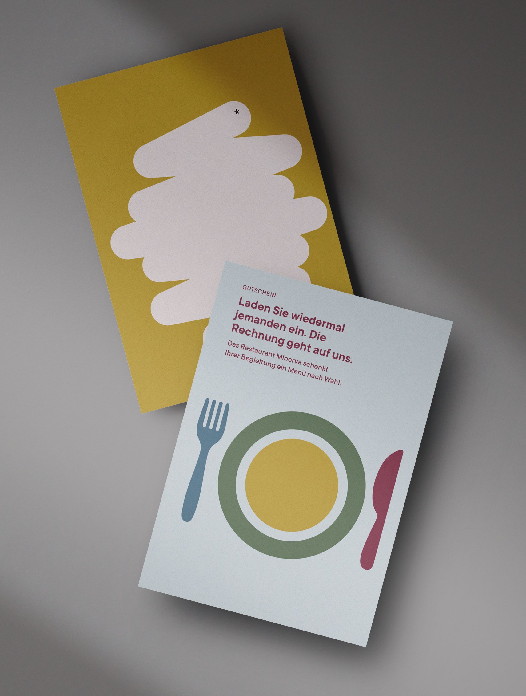
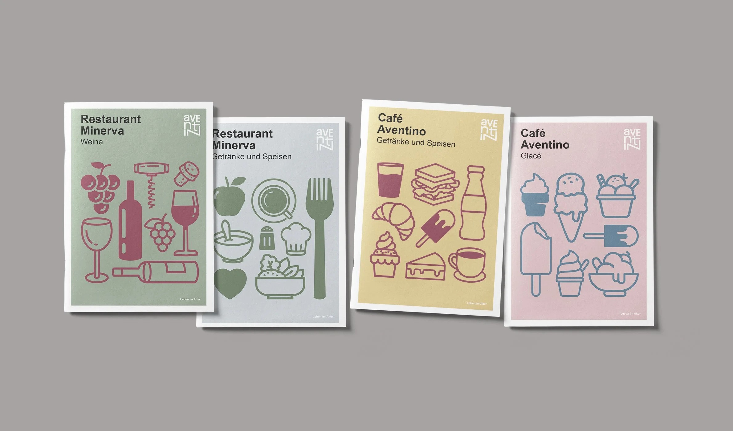
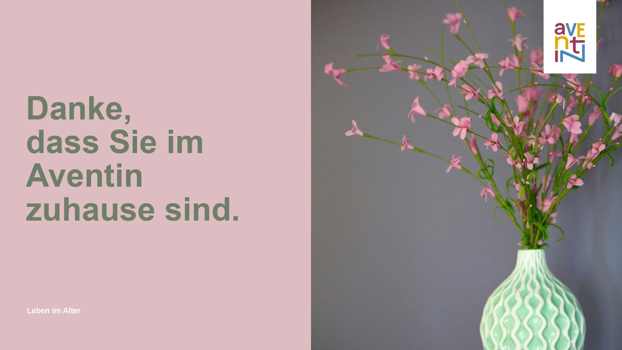
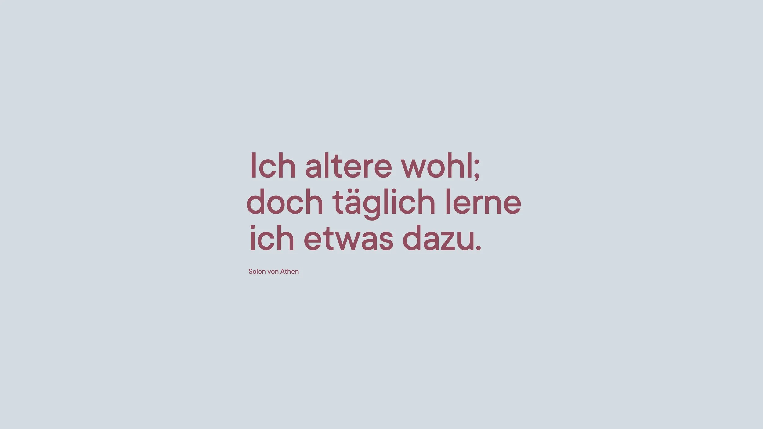
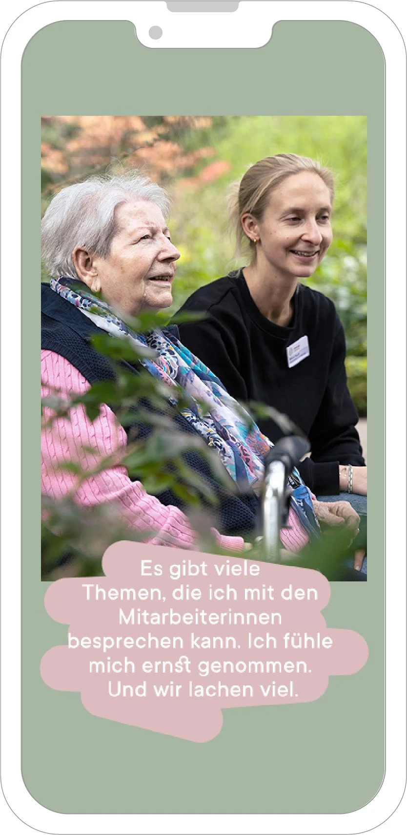
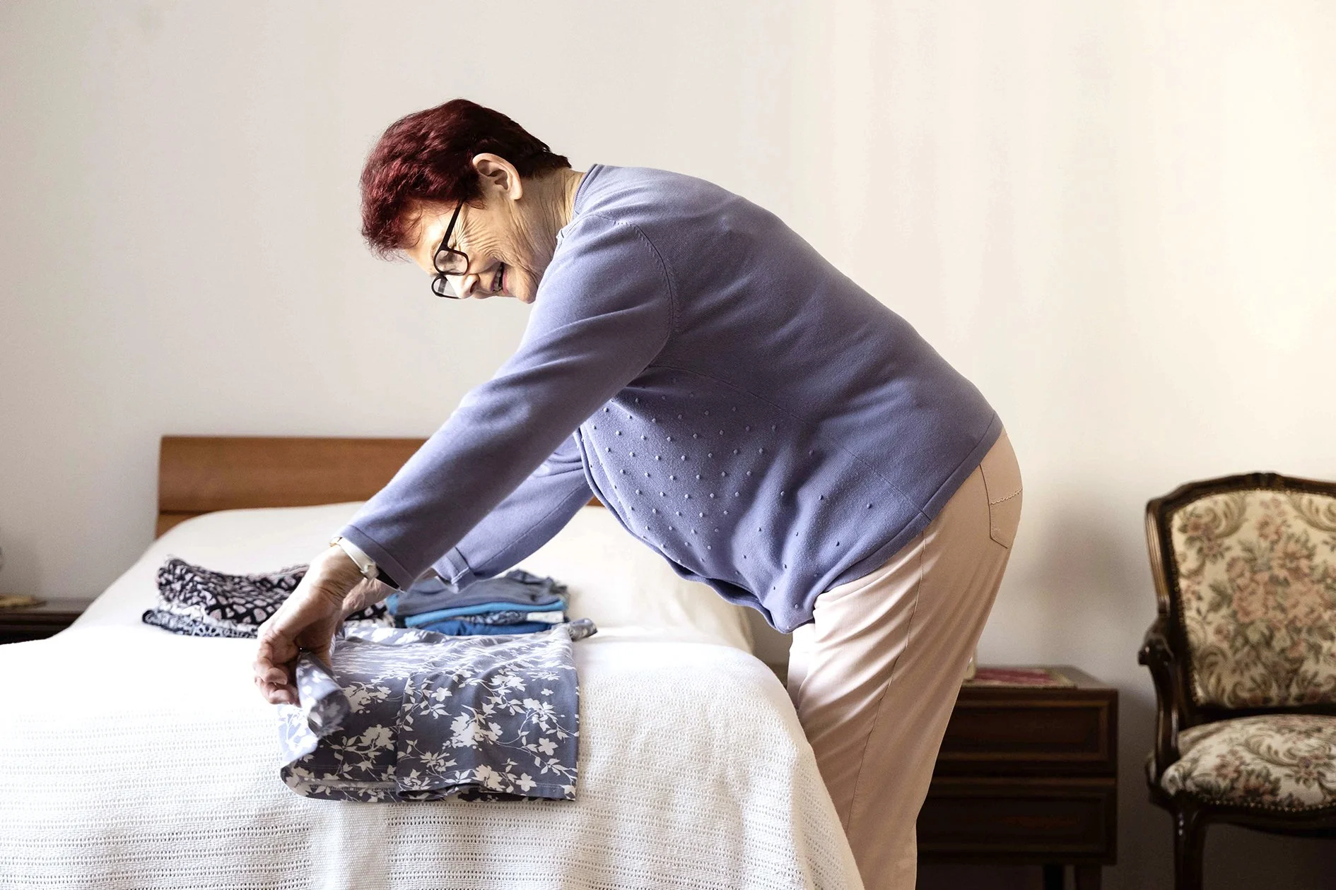
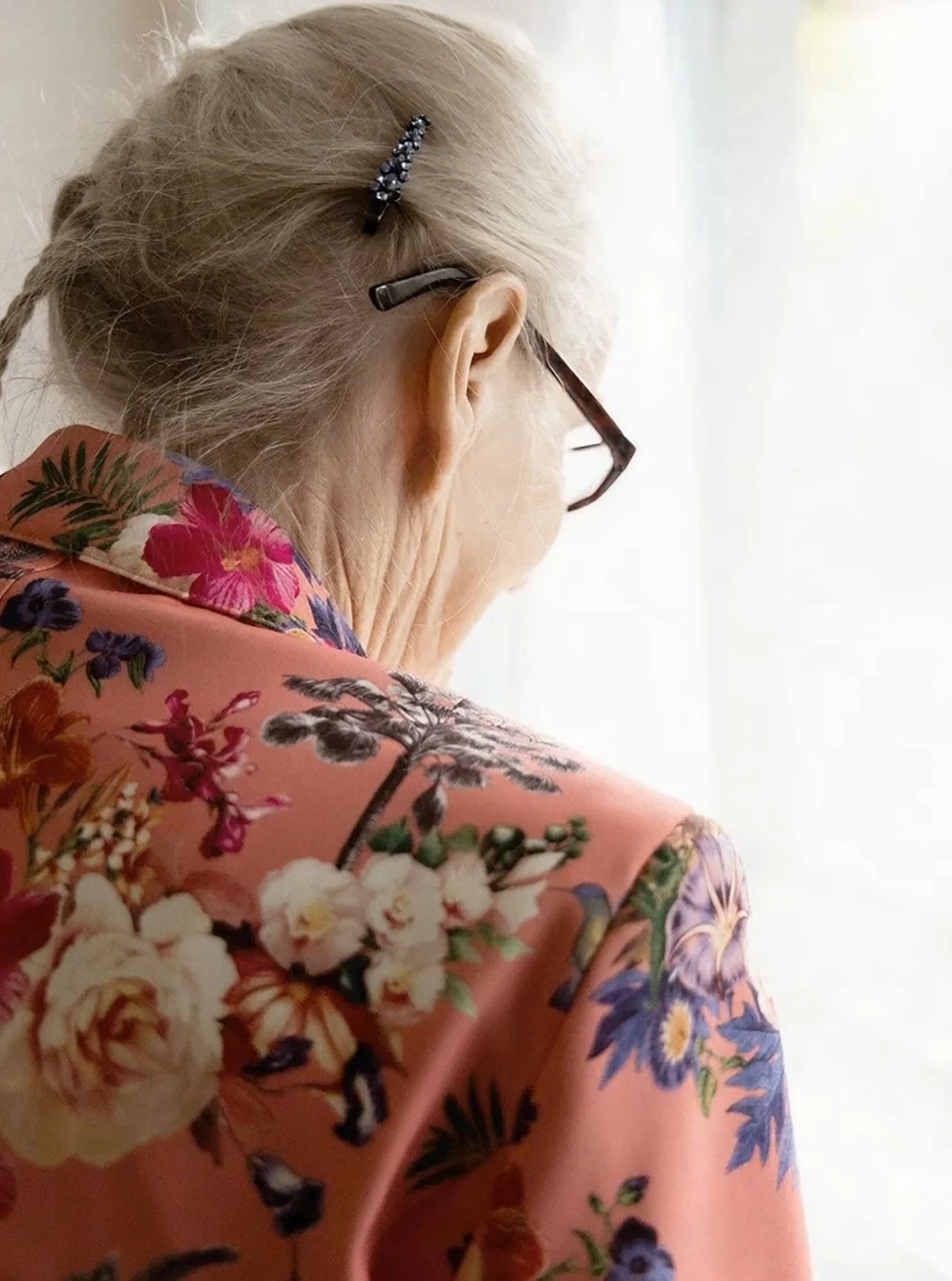
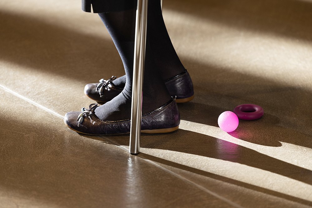
Since photography featuring real people in the context of a retirement home is a sensitive issue, the visual identity is deliberately based on typography, color, and iconographic illustrations. A minimalist, modular design system enables consistent communication across all channels – and is structured in such a way that it remains easy to use internally.
Particular attention was paid to standardizing the numerous forms, templates, and communication tools. Color schemes, illustrations, and structuring design elements create orientation, recognizability, and calm – both internally and externally. -
The new look is being rolled out today across all communication channels – both digital and analog. It reinforces the perception of GGN and Aventin as contemporary, responsible institutions with a clear stance and high social relevance.
Internally, the system provides orientation and security in its application. Externally, it conveys trust, openness, and modernity. The rebranding is not intended as a one-off measure, but as a long-term basis for consistent communication.


Develop identity with attitude.
Whether you are a non-profit institution, educational organization, or company undergoing change, we help make complex structures understandable—visually, strategically, and sustainably.