Packaging design for nutritional supplements – with attitude.
Studio Blyss designs packaging for brands in the field of vitamins, supplements and functional nutrition. Not interchangeable, but precisely tailored to the active ingredient, market environment and target group.
Our strength: design with system, feeling – and overview.
We develop packaging designs that work – on the shelf, in the e-shop and when unpacking. From the mono-product to the modular series, from material consulting to the limited edition with collector's item character.
Natural. Effective. Visually precise.
We think along – with declaration, claims, target markets and sustainability aspects. Our experience ranges from start-ups with a high cycle rate to industrial partners with a complex portfolio.
From brand identity to series production.
We accompany the entire process – from naming to print approval. With a keen sense for design, economic foresight and a clear view of the regulatory framework.
Our services for Health & Nutrition Brands
Brand development & naming
Packaging design & material consulting
POS and online shop presentation
Edition and limited concepts
Print preparation, production & support
Sustainable packaging systems
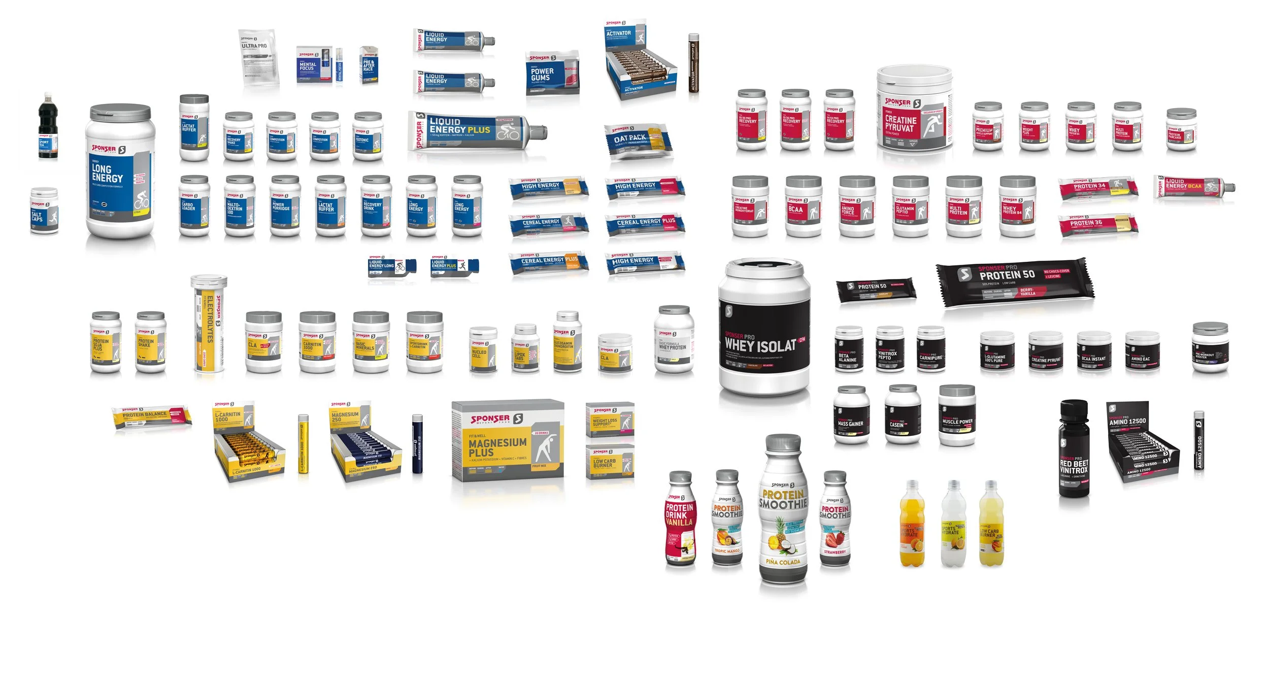
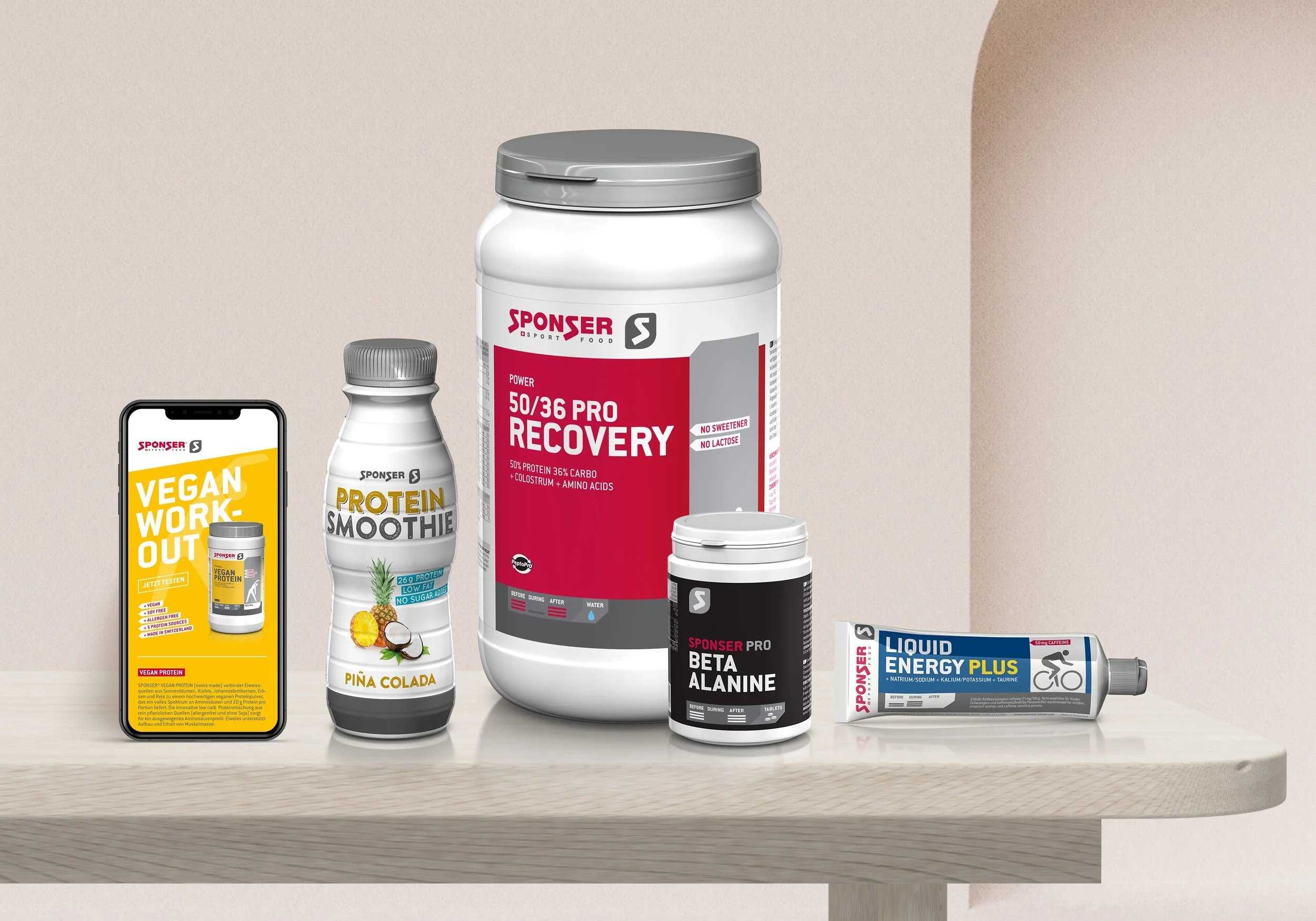
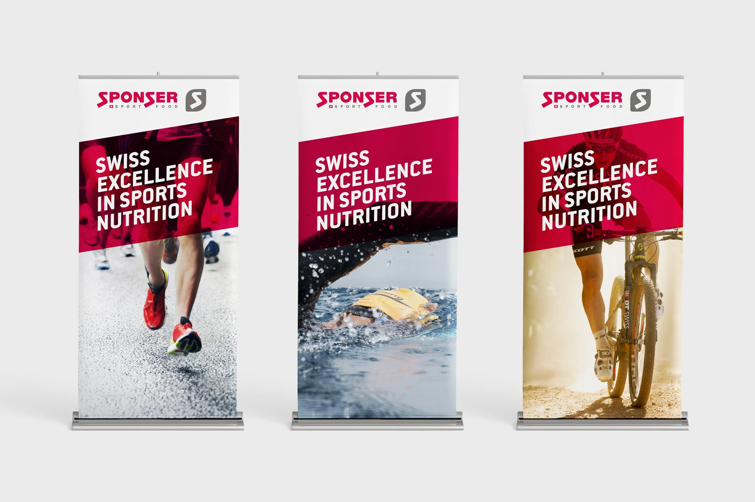
For more than ten years, Studio Blyss has accompanied Sponser's packaging world – from rebranding to series maintenance, from bags to export cans. A total of over 150 products were supported.
Our contribution
Visual redesign and ongoing maintenance within an existing design system
Rollout of new packaging formats and product lines
Coordination with printers, suppliers and legal teams
Layouts for nutritional information tables, claims and multilingual versions
This project demonstrates how a deep understanding of brands, technical precision and long-term implementation come together – an experience that we now bring to new projects in a targeted manner.
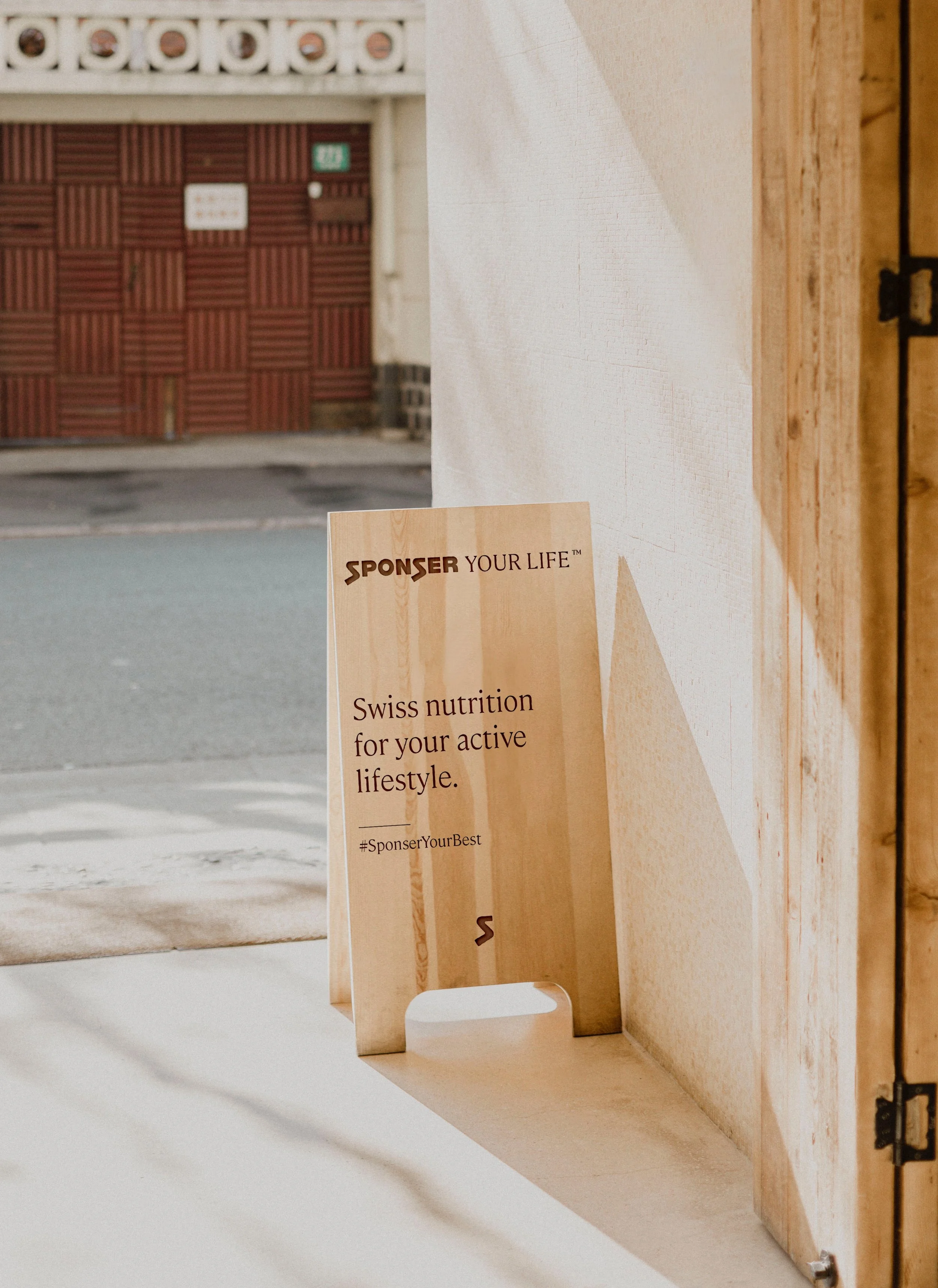
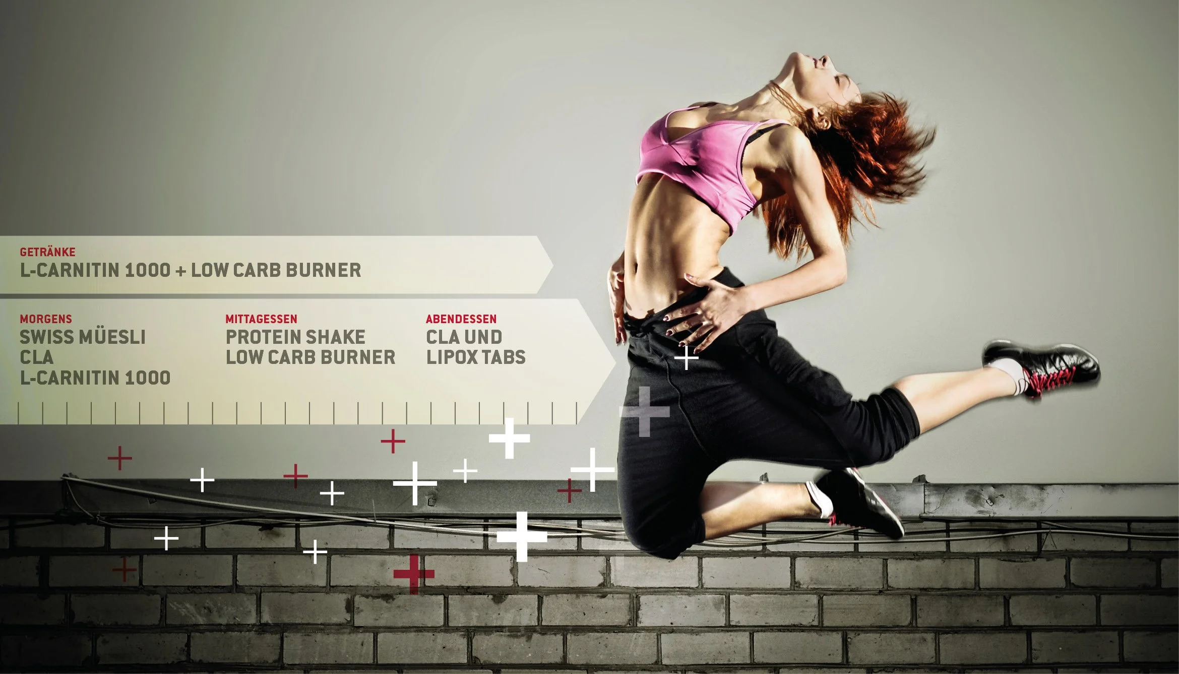
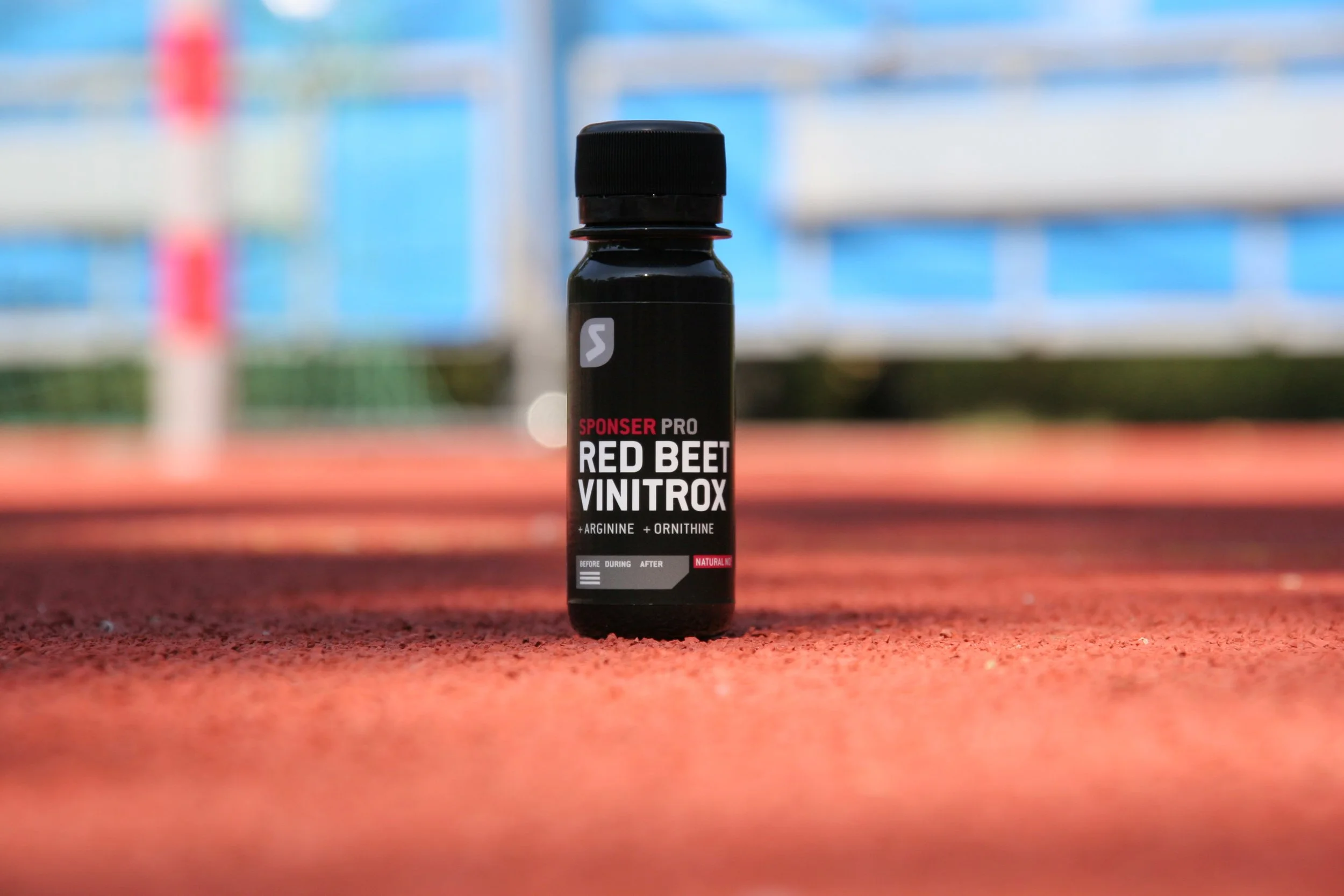
Sponser Sport Food.
Long-standing packaging partnership with the Swiss market leader in sports nutrition.


What makes us the ideal design partner for nutritional supplements
We don't just design – we think from the active ingredient to the perception.
Whether capsule, shot or powder: we translate product promises into differentiated, precise packaging design.
We know how to bring bold storytelling and regulatory clarity together.
Brand at the front, facts at the back – with attention to detail and a sure sense of dosage and declaration.
We think in series, editions and scalable systems.
From MVP to the shelf – scalable, modular, brand-appropriate.
We work safely through all markets, languages and regulations.
From the CH launch to the EU-wide rollout series – with production support on request.

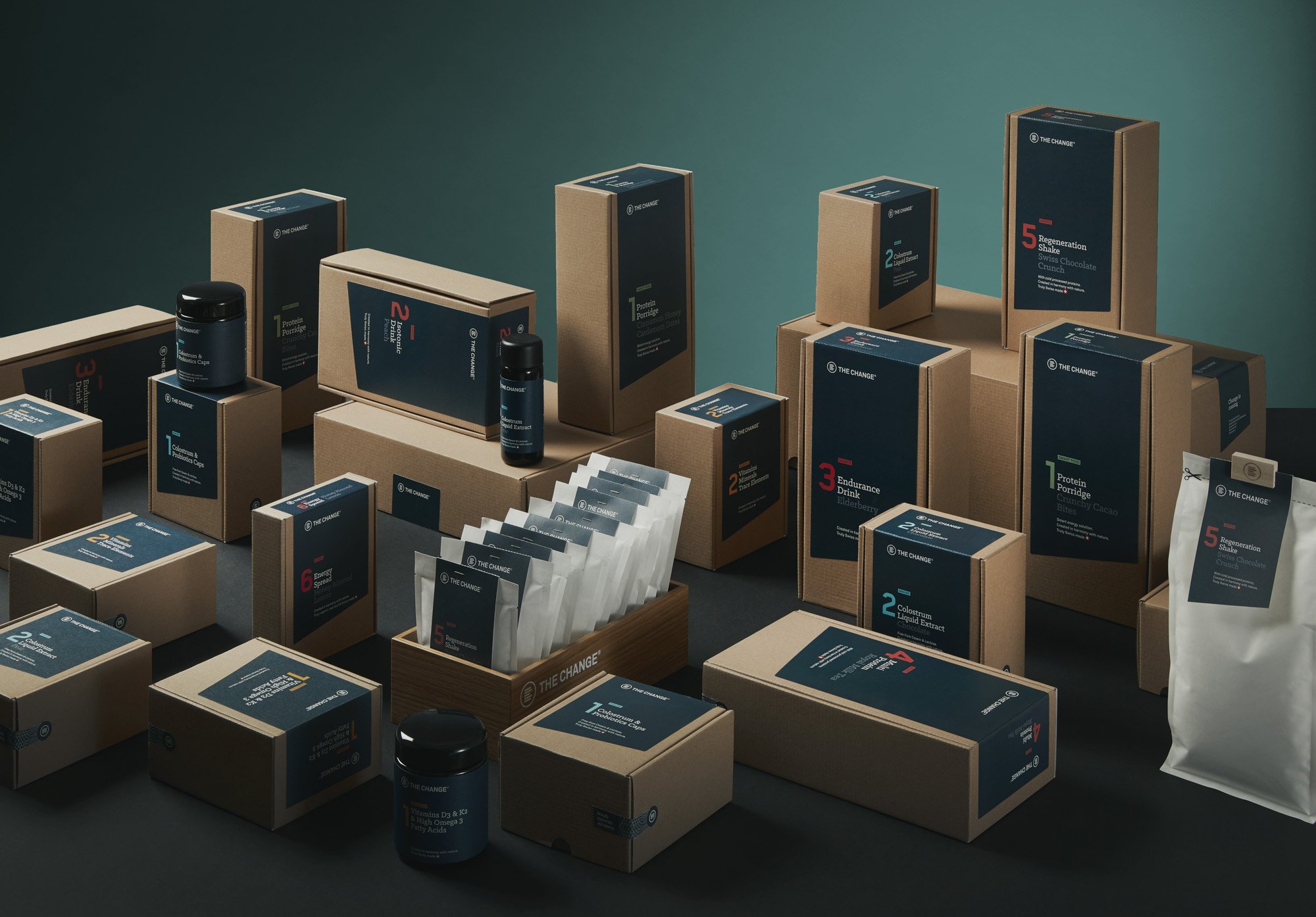
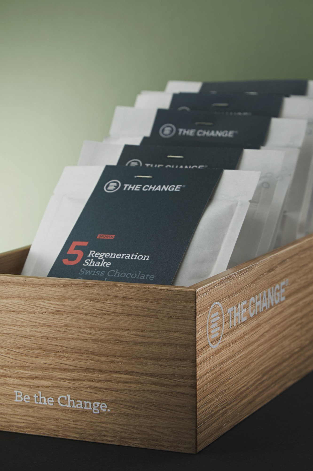
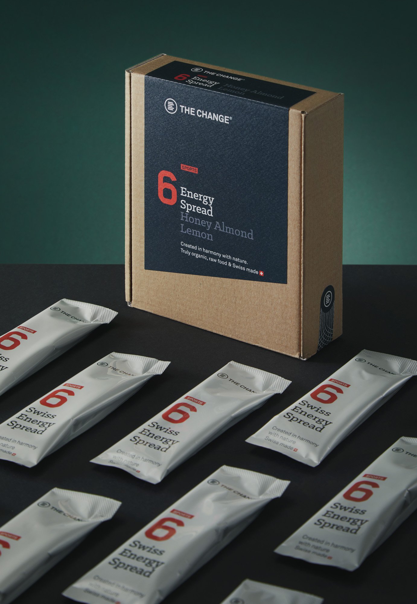
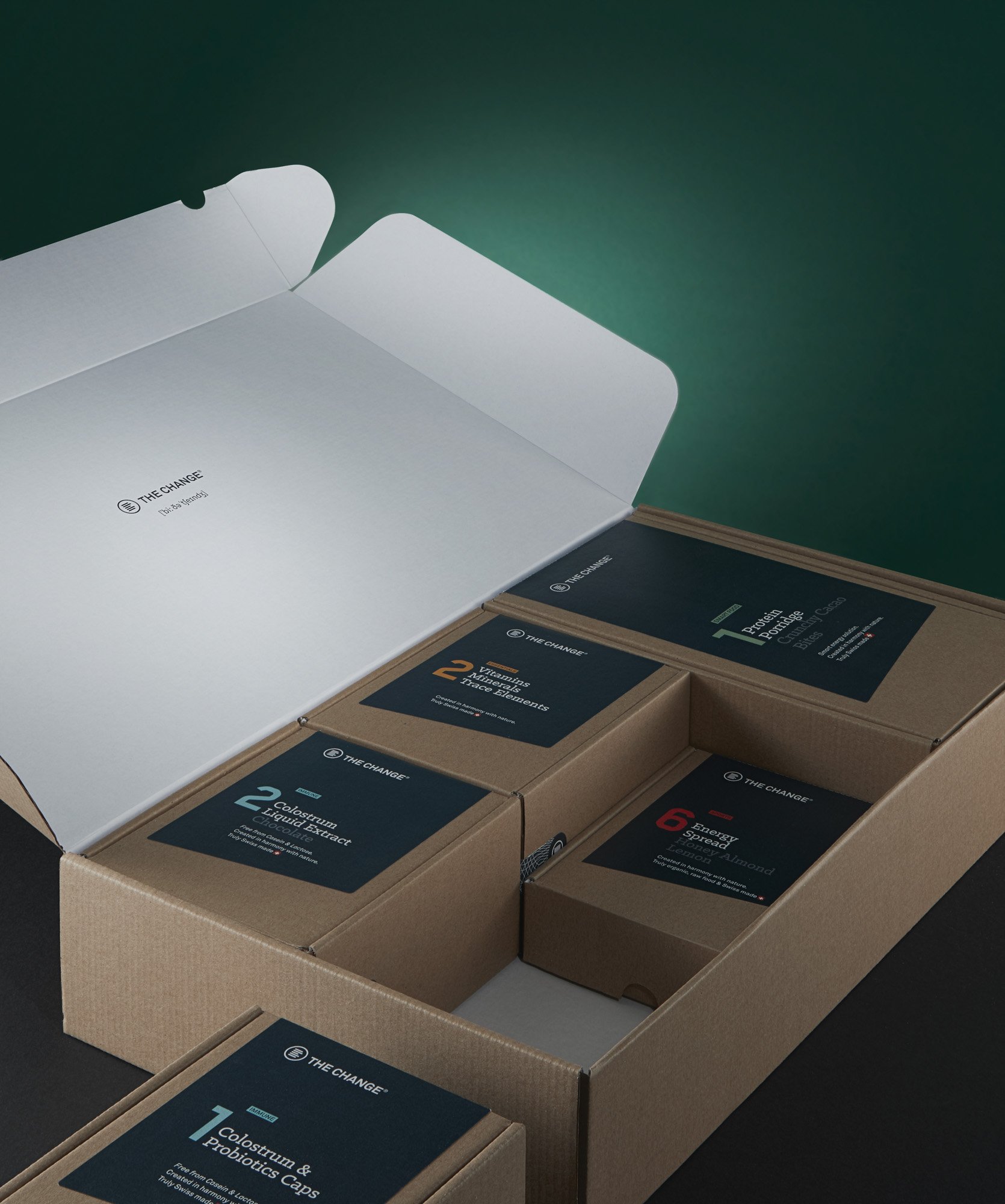
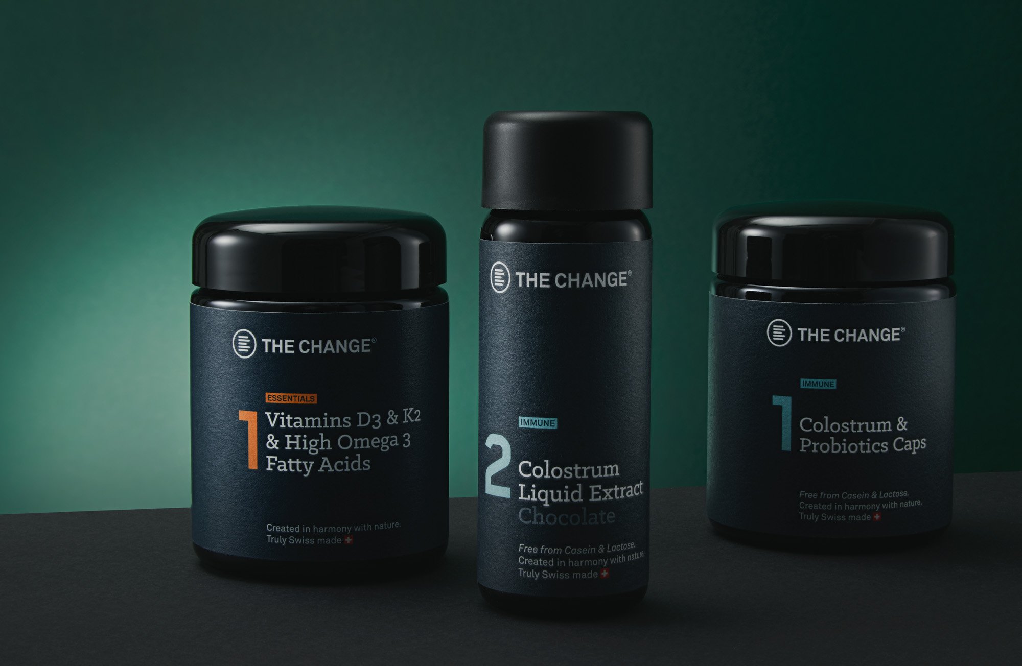
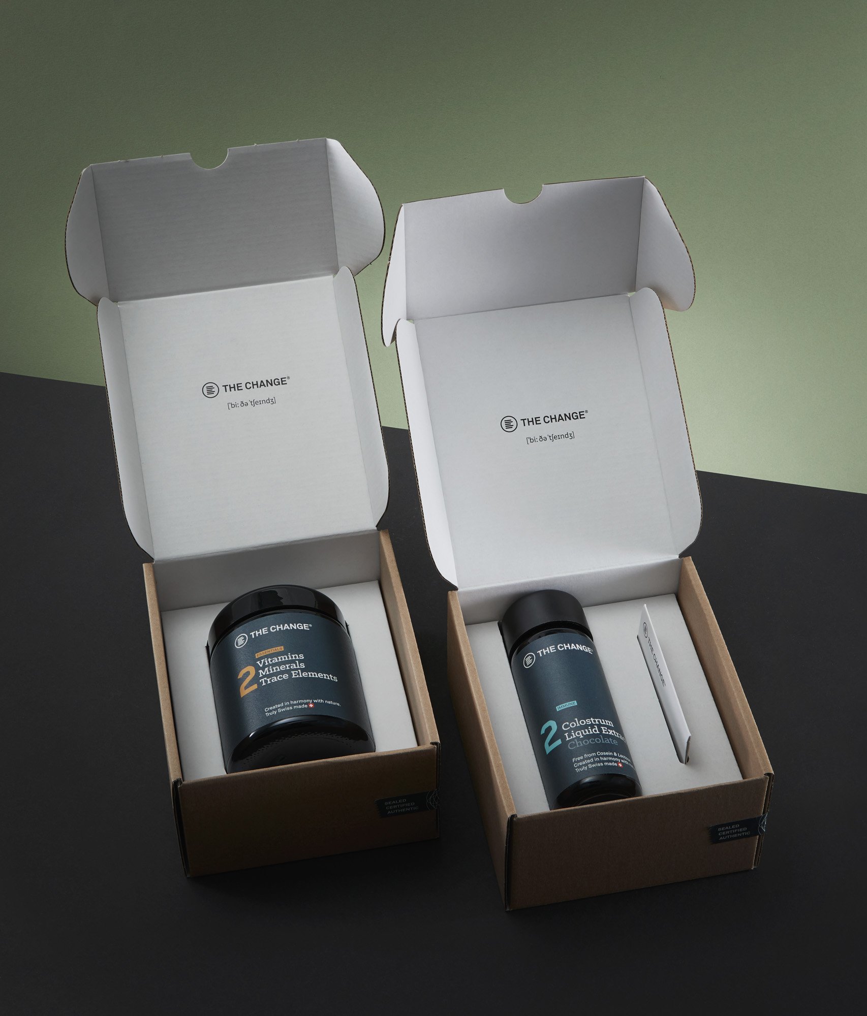
Be the Change.
Confident, well thought-out - and ready for the shelf.
We have been supporting the Be the Change brand for over 12 years: from naming and visual identity to the packaging system across several product lines. The brand stands for high-quality, scientifically based nutrition with ethical standards – and for an uncompromising attitude when it comes to sustainability.
Our contribution – from the beginning until today:
Complete material change from PET to 100 % sustainable packaging systems
Development of modular label logic for different formats
Striking shelf impact while maintaining scientific credibility
Consistent storytelling across online and offline touchpoints
Be the Change shows how design, material expertise, and attitude interlock.

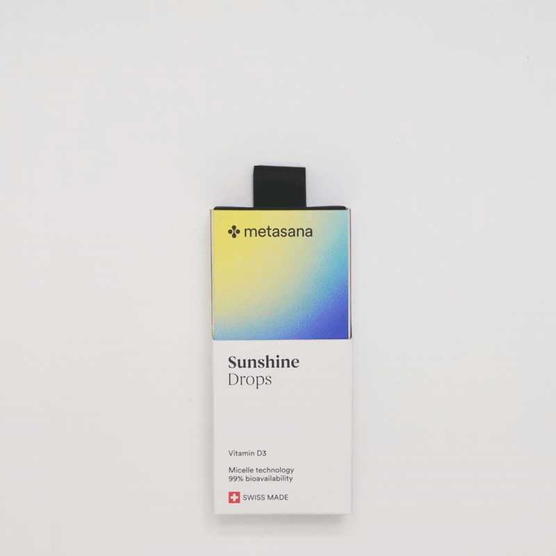
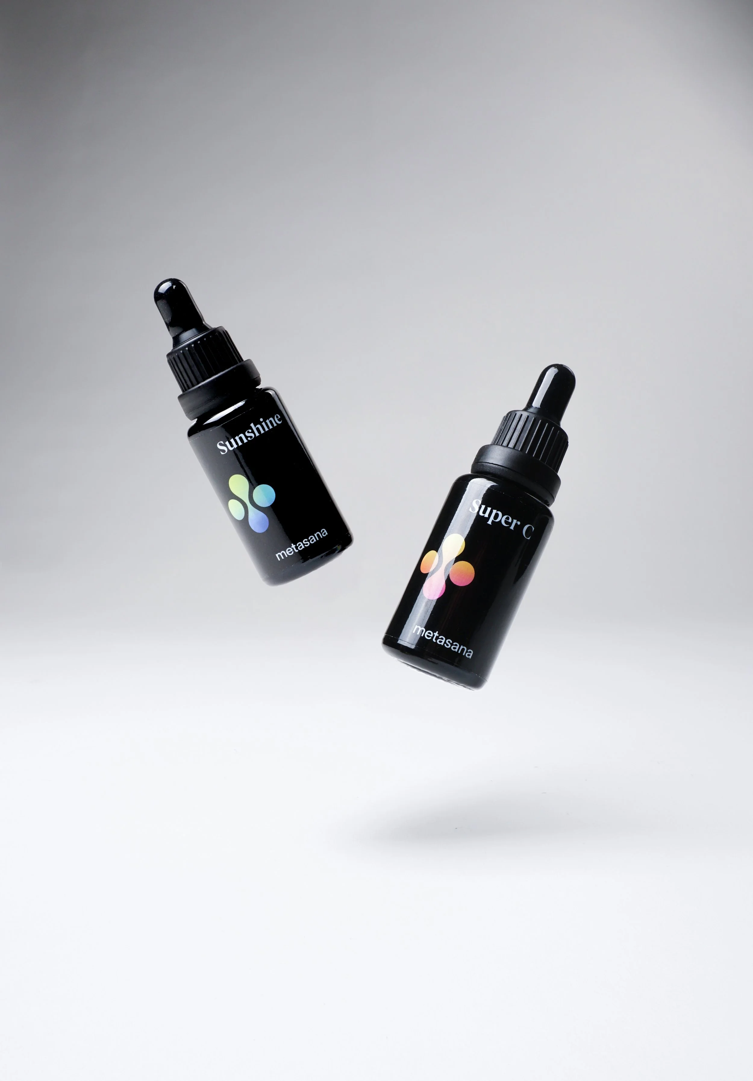
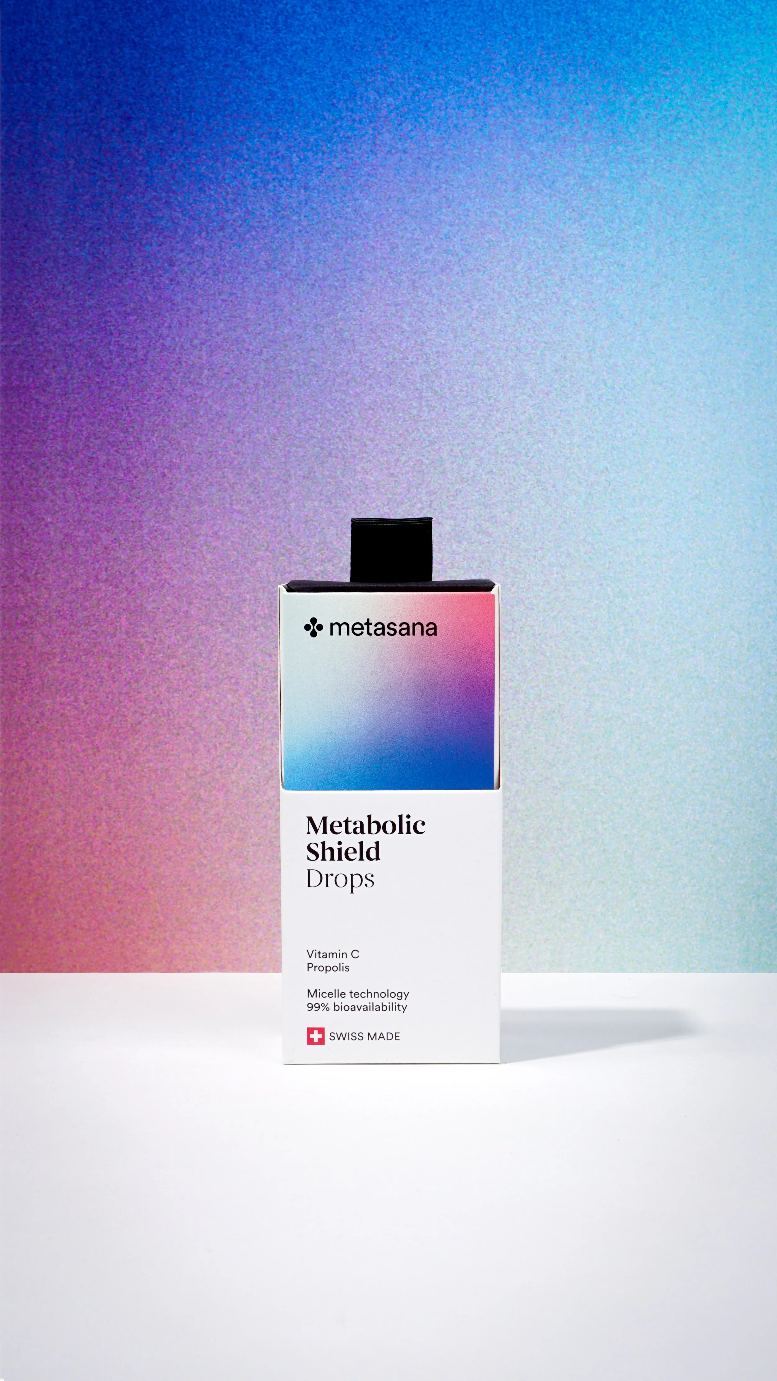
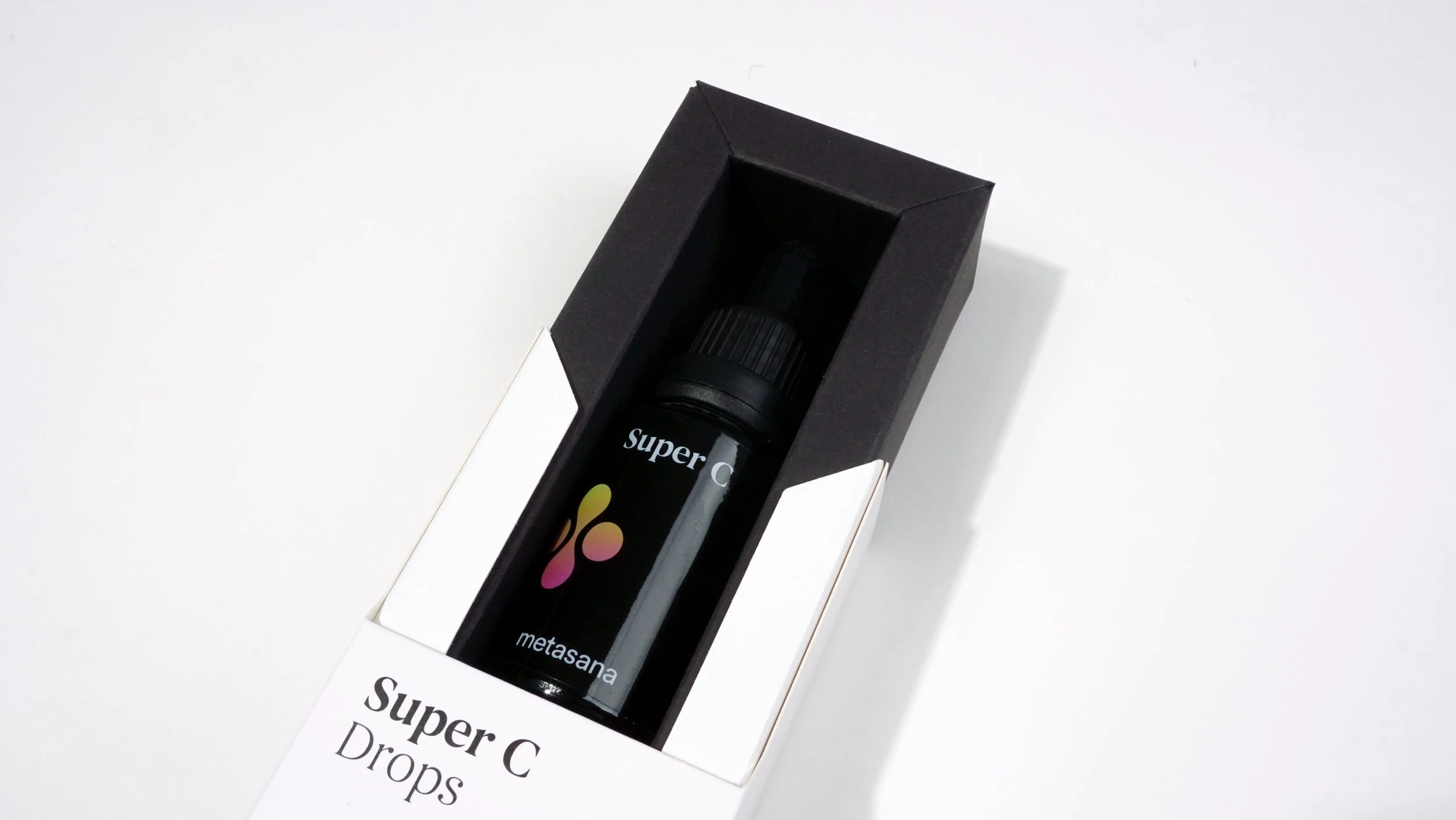
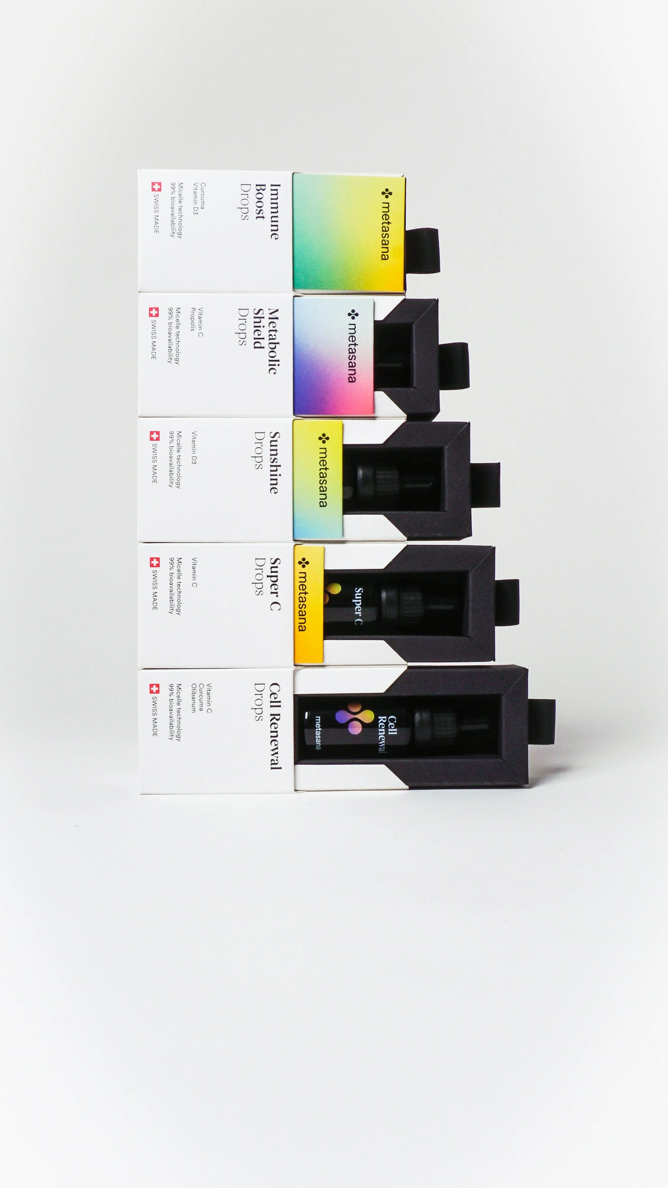
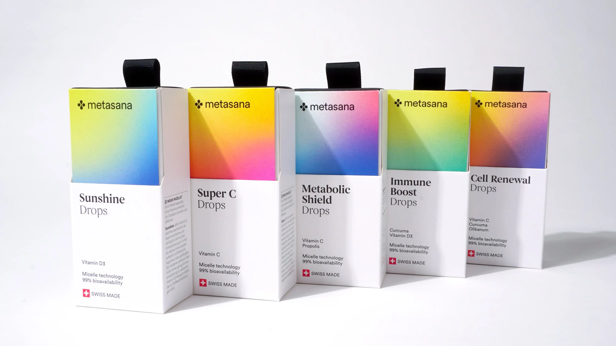
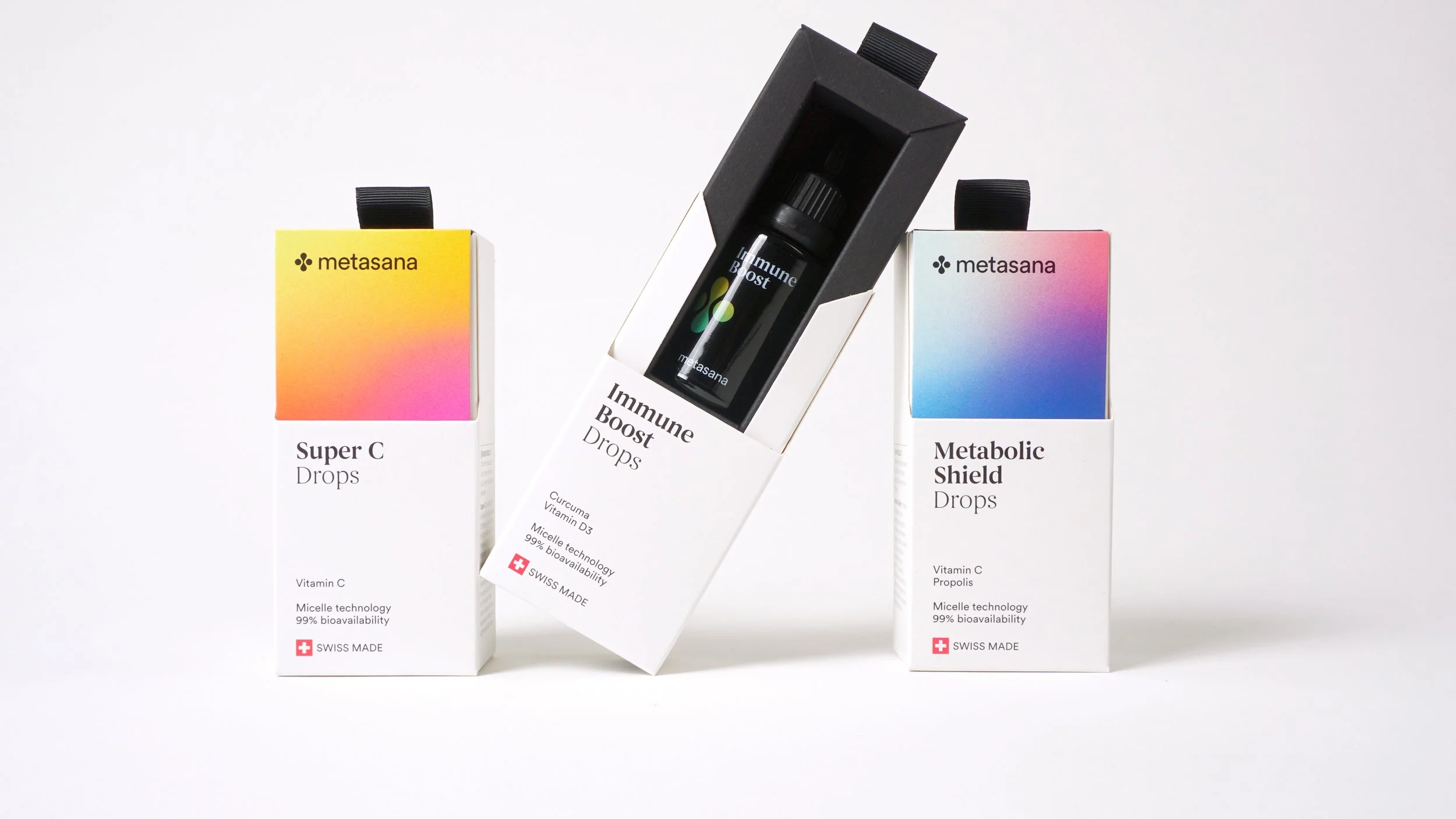
Metasana.
Independent on the shelf. Playful to use.
For Metasana, we've crafted a distinctive brand identity that clearly stands out from the typical pharmacy uniformity.
From branding to packaging, we created a precise interplay of clarity, lightness, and trust – including a playful opening mechanism that enhances the product experience and leaves a lasting impression.
Our contribution
Development of a coherent, modern brand identity
Design of an original, functional packaging mechanism
High-quality materials and fine printing finishes for a tactile presence
Balance of regulatory clarity and strong emotional appeal
Implementation across product lines and marketing channels
The result
A health brand with character – professional, approachable, and surprisingly user-friendly.

Ready for the next step?
Whether it's a startup in the spotlight or a traditional brand undergoing change – we design packaging that builds trust, makes an impact, and works in everyday life.